Data Visualization & Dashboard
by Yin Yin Chan 🤓 July 2026
TL;DR
We've successfully tranformed our original raw data into dimension and fact tables more fitting our of querying needs in Analytics Engineering and Modeling with Star Schema.
Now, we can create some data visualizations within Snowflake's Workspace to display our fully transformed dataset in a couple different ways.
Data Visualization
We round out our end-to-end data engineering pipeline with a native Snowflake dashboard to visualize the fruits of our labor. We implement a simple dashboard solution to show that the underlying storage, compute, and modeling layers operate successfully.
Generate Categorical Chart
- Log into Snowflake
- Open a Project > Workspace
- Open a new SQL file (+ Add new > SQL file > dashboard.sql)
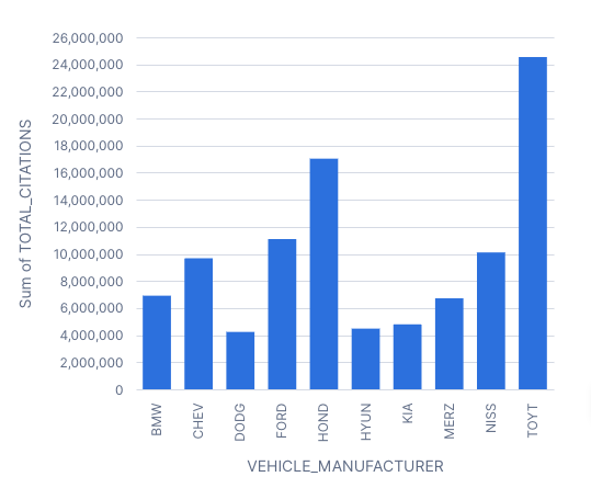
- Paste and run the following categorical query:
USE ROLE ACCOUNTADMIN;

USE DATABASE ladot_warehouse;
USE SCHEMA core;

SELECT
    v.make AS vehicle_manufacturer,
    COUNT(f.ticket_number) AS total_citations
FROM fact_citation f
JOIN dim_vehicle v
  ON f.vehicle_key = v.vehicle_key
GROUP BY v.make
ORDER BY total_citations DESC
LIMIT 10;
You can re-write the query as you wish, experiment with different data output for analysis. Once you’re ready to provide
- Click on the “Chart” tab in the Results panel for a chart view.
Generate Temporal Chart
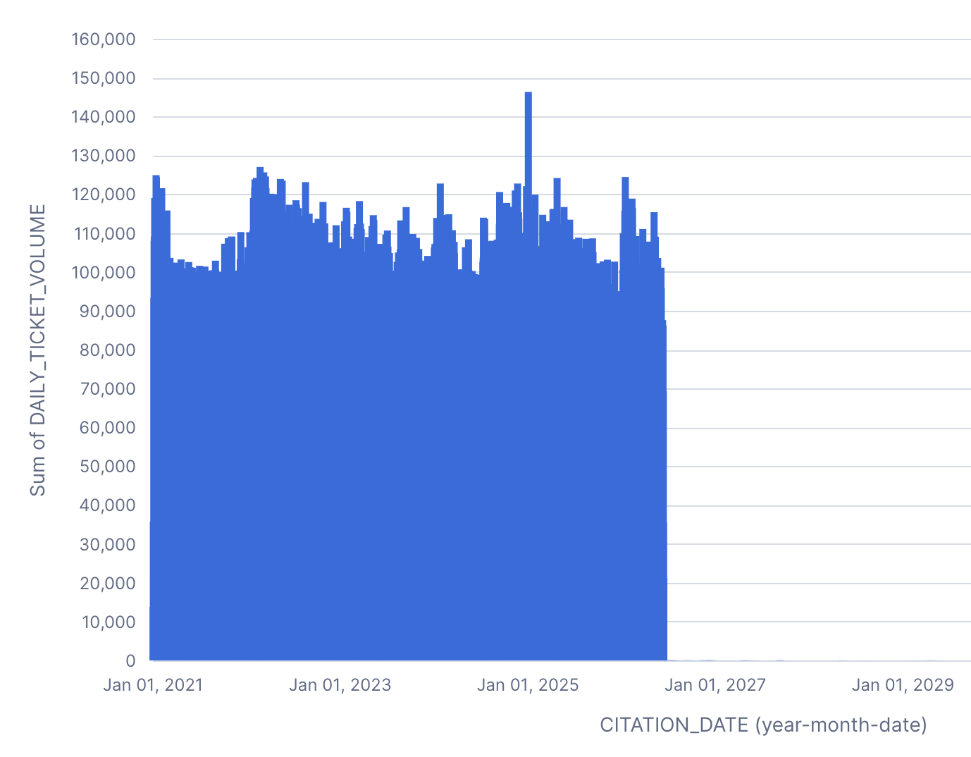
- Paste, select, and run only this temporal SQL block to calculate daily citation timelines:
SELECT
    date_key AS citation_date,
    COUNT(ticket_number) AS daily_ticket_volume
FROM fact_citation
GROUP BY date_key
ORDER BY date_key ASC;
- Click on the “Chart” tab in the Results panel for a chart view.